IRON HOUSE
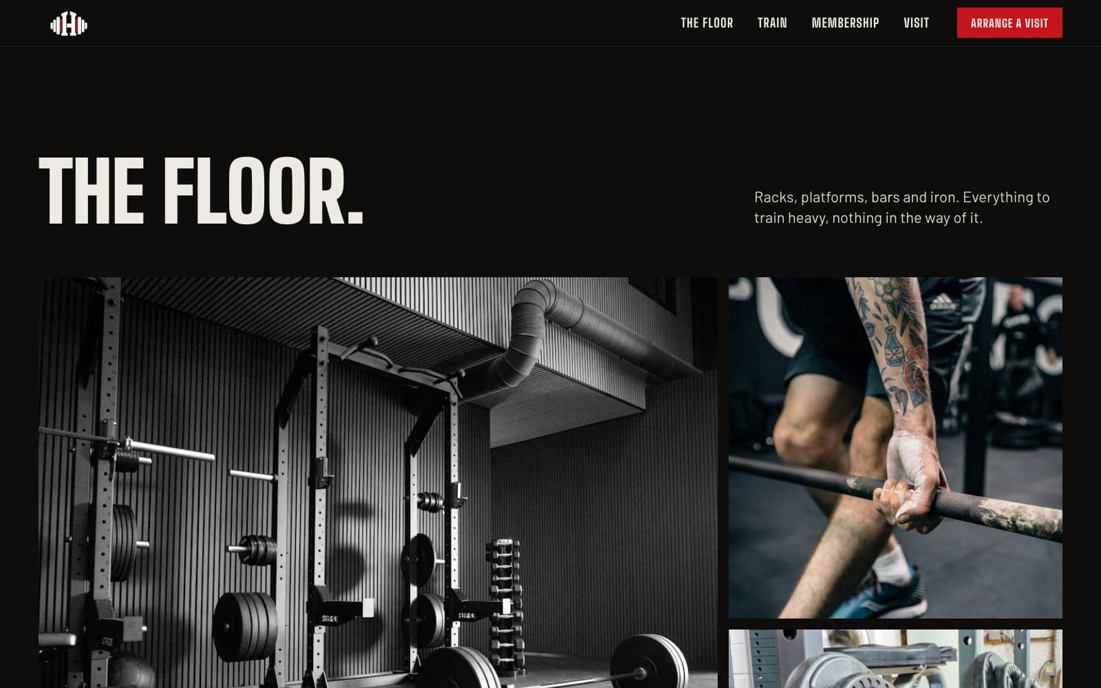
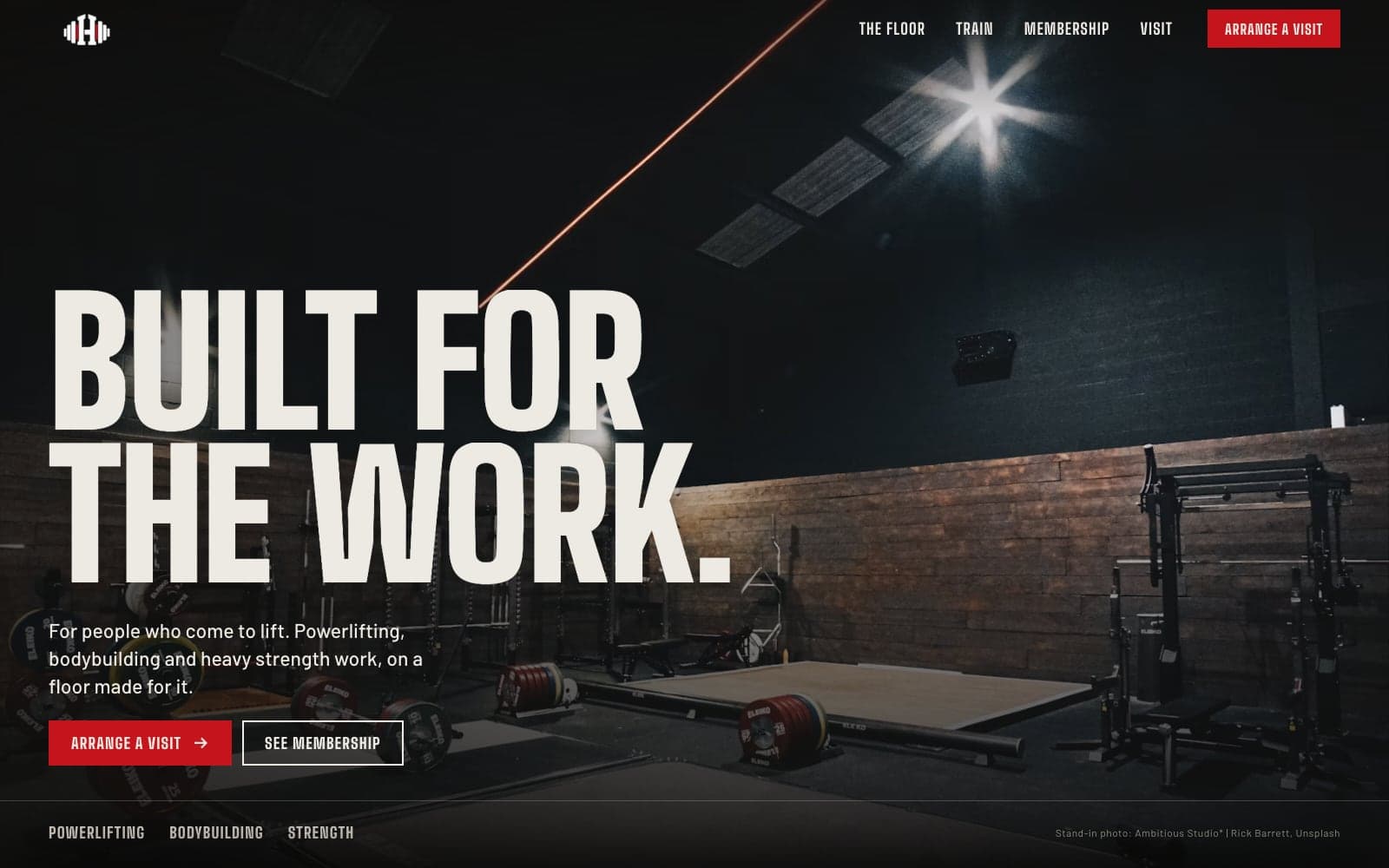
A homepage for an independent lifters' gym that opens on the floor itself: racks, platforms and iron, with the way in one tap away.
- Client
- IRON HOUSE (concept)
- Year
- 2026
- Category
- Brand
- Scope
- Gym, Parallax, Editorial
- Status
- Concept
Not live yet.
Overview
IRON HOUSE is a concept site for an independent strength gym built around powerlifting, bodybuilding and heavy training. It had to feel like walking onto the floor, not like a chain gym's sales page.
The challenge
Lifters spot a generic fitness site in a second: stock smiles, neon and slogans. They want to see the kit, understand how the place trains and know how to come in for a look, mostly from a phone.
The solution
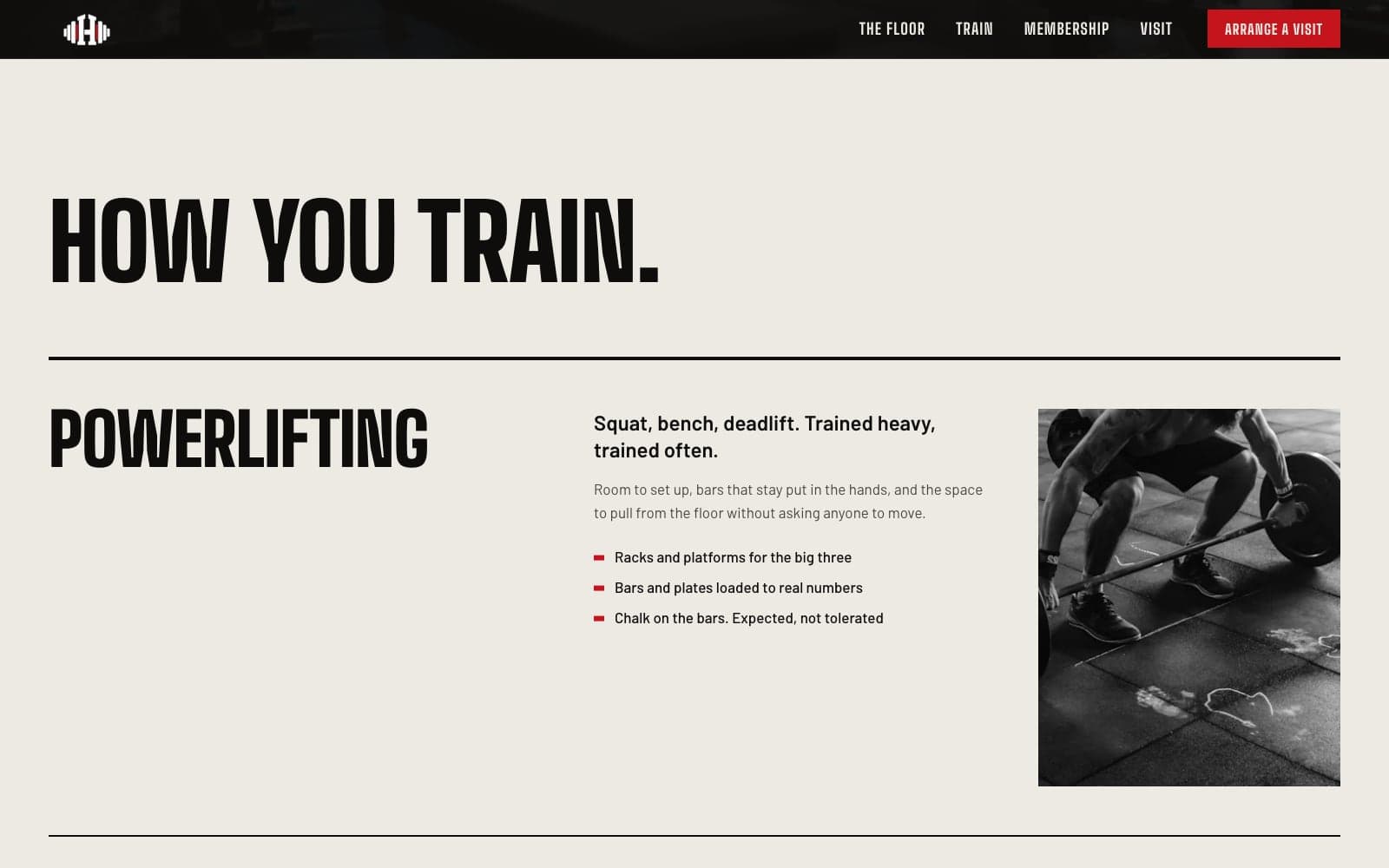
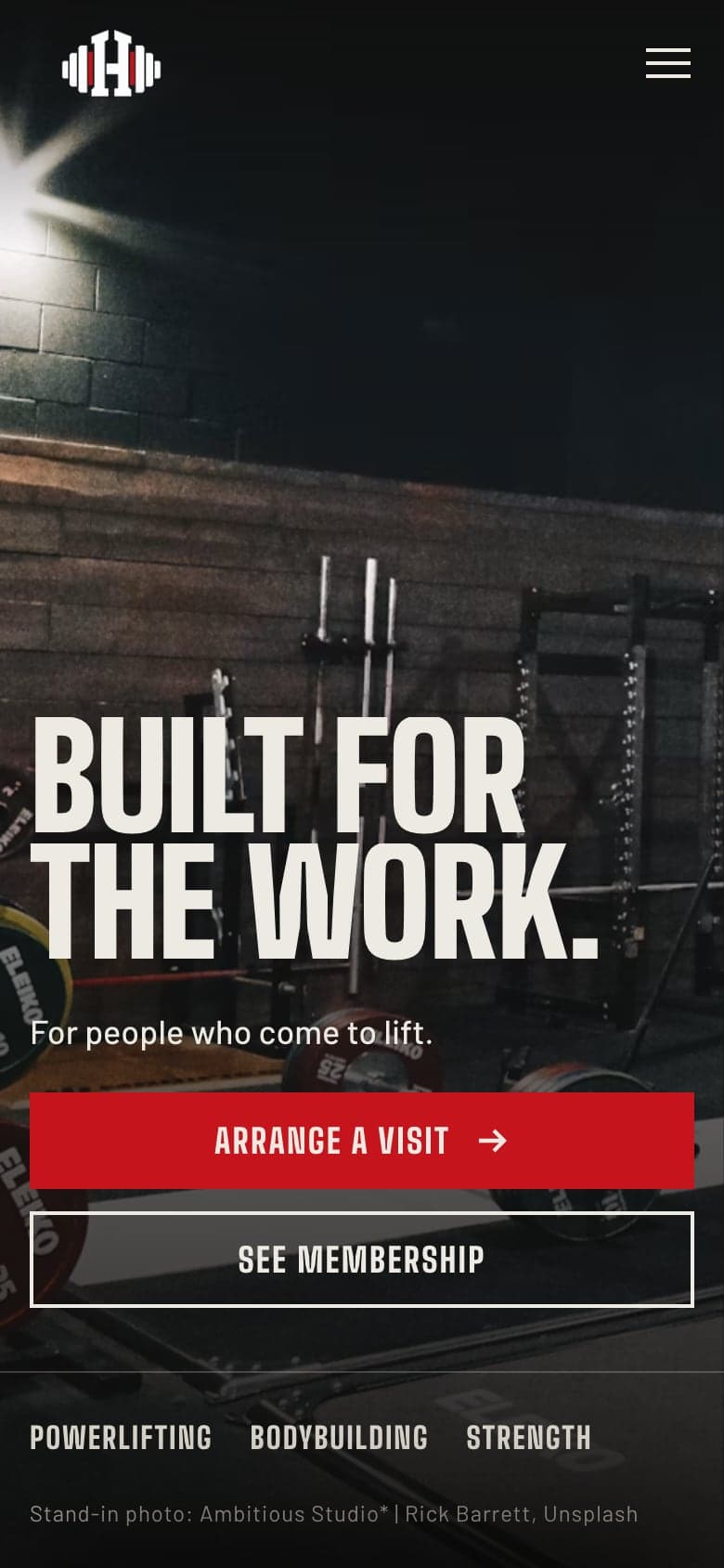
A full-bleed gym photograph under heavy condensed type, with a photo reveal, gentle parallax and a curtain into the floor gallery and equipment list. Training is split into powerlifting, bodybuilding and strength, then membership and visiting details set out plainly. Near-black, chalk and the logo's red, and every animation switches off for reduced motion.